Vivienne Prince

Thanks for dropping by my page!
I'm currently a Masters of Data Science student graduating in 2022.
I really enjoy learning new tools, exploring data to help solve problems, and helping others understand ideas and data.
Reddit Cryptocurrency Historical Sentiment vs Price
November 2020 – with Kalani Stanton and Tim McCormack
Overview:
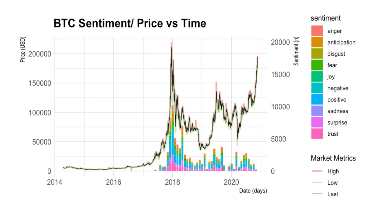
We used user post and comment data from Reddit’s two most popular crypo subreddits to explore change in average sentiment over time for BTC, ETH, LTC, and XRP (ripple) in context with the currencies’ value.
Tools:
Python Reddit API Wrapper: pull reddit comment data
Tidyverse/ Tidytext: [NLP] tokenization and sentiment analysis
Quandl: pull coin price history
ggplot/ plotly: viz
Language used: R/ Markdown
For full details see our git repo :-)
This is a time series sentiment vs price data visualization I put together for our project:

My code:
# function for getting Coin Price/ Sentiment vs Time graph by coin

get_graph <- function(coin, coeff) {   # coin = "COIN_NAME", coeff = Value used to transform sentiment to match price scale on graph

  # get related coin data
  coinprice_data <- PricesByCoin %>% filter(Coin == coin)
  coin_sntmntByMonth <- sntmntByMonth %>% filter(Coin == coin)

  # reshape coin price by day data to merge high, low, last, med into one variable
  price_by_mkt_metric <- melt(coinprice_data, id = c("Date", "Coin"))
  colnames(price_by_mkt_metric)[3] <- "Mkt_Metrics"

  # normalize x-values for both datasets (date)
  price_by_mkt_metric$Date <- as_date(price_by_mkt_metric$Date)
  coin_sntmntByMonth$Month <- as_date(coin_sntmntByMonth$Month)


  # make the gg plot
  Coin_Daily_Price.plot <- price_by_mkt_metric %>%
    filter((Mkt_Metrics %in% c("High", "Low", "Last"))) %>%

    # ggplot setup
    ggplot(aes(x = Date)) +
    theme_minimal() +
    ggtitle(paste(coin, " Sentiment/ Price vs Time")) +
    xlab("Date") +
    theme(legend.title = element_blank())  +


    # plot price vs time lines
    geom_line(
      stat = 'identity',
      aes(
        y = value,
        linetype = Mkt_Metrics,
        color = Mkt_Metrics,
        size = Mkt_Metrics,
        alpha = Mkt_Metrics)) +
    scale_linetype_manual("Market Metrics", values = c("solid", "solid", "solid")) +
    scale_color_manual("Market Metrics", values = c('#EF9A9A', '#C5E1A5', '#212121')) +
    scale_size_manual("Market Metrics", values = c(1, 1, 0.3)) +
    scale_alpha_manual("Market Metrics", values = c(0.8, 0.8, 1)) +


    # plot sentiment bars (stacked)
    geom_bar(
      data = coin_sntmntByMonth,
      stat = 'identity',
      aes(
        x = Month,
        y = n / coeff,
        fill = sentiment)) +


    # setup y-axises
    scale_y_continuous(name = "Price (USD)",
                       sec.axis = sec_axis( ~ . * coeff,  name = "Sentiment (n)"))

  # convert to plotly
  Coin_Daily_Price.plotly = ggplotly(Coin_Daily_Price.plot, tooltip = c("label","x","y"))

  # cleans up legend labels
  for (i in 1:length(Coin_Daily_Price.plotly$x$data)) {
    if (!is.null(Coin_Daily_Price.plotly$x$data[[i]]$name)) {
      Coin_Daily_Price.plotly$x$data[[i]]$name =  gsub("\\(", "",
          str_split(Coin_Daily_Price.plotly$x$data[[i]]$name, ",")[[1]][1])
    }
  }

  Coin_Daily_Price.plot
  Coin_Daily_Price.plotly

}

get_graph("BTC", 4)
get_graph("ETH",20)
get_graph("LTC", 19)
get_graph("XRP", 8000)